
Matplotlibで表示するグラフは基本的に同じサイズになってしまいます。
そこで、サイズを変えて表示できるsubplot_mosaicを紹介します。
事前準備
まずはライブラリやデータの準備をします。
ライブラリのインストール
まずは必要なライブラリをインストールします。
import numpy as np
import matplotlib.pyplot as plt
使用するデータ
グラフを作るために、適当なサンプルデータを作ります。
今回はサインカーブを描画したりヒストグラムを作ったりします。
x = np.linspace(0, 10, 100)
y1 = np.sin(x)
y2 = np.cos(x)
y3 = x**2 * 0.1
グラフの描画
ここからplt.subplot_mosaicでのグラフ作成方法を解説します。
通常の描画
まず、plt.subplotsを使った場合は以下のようなグラフが表示されます。
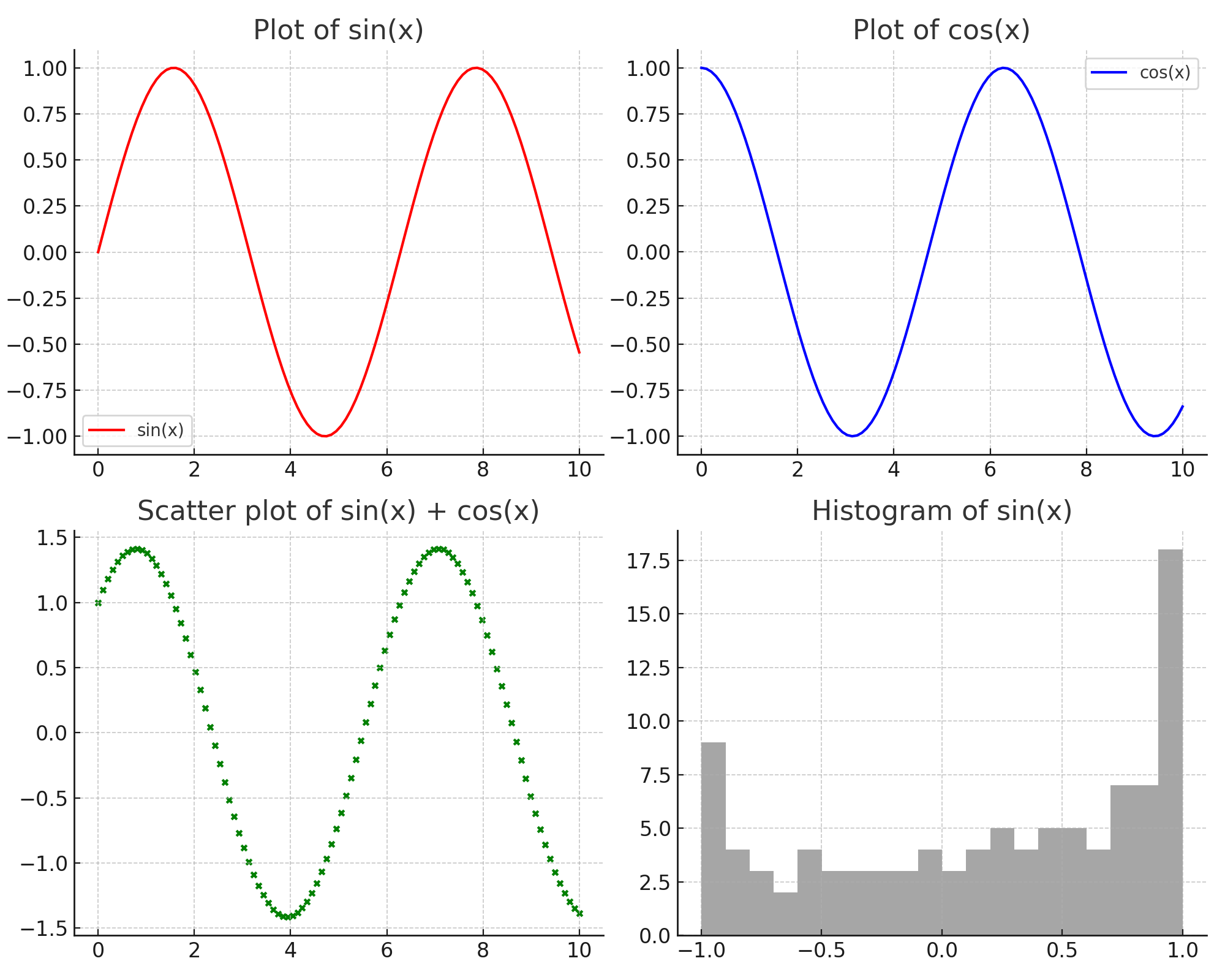
コードは以下を参考にしてください。
fig, axarr = plt.subplots(2, 2, figsize=(10, 8))

# それぞれのサブプロットにデータをプロット
axarr[0, 0].plot(x, y1, label='sin(x)', color='red')
axarr[0, 0].set_title('Plot of sin(x)')
axarr[0, 0].legend()

axarr[0, 1].plot(x, y2, label='cos(x)', color='blue')
axarr[0, 1].set_title('Plot of cos(x)')
axarr[0, 1].legend()

axarr[1, 0].scatter(x, y1+y2, color='green', s=10)
axarr[1, 0].set_title('Scatter plot of sin(x) + cos(x)')

axarr[1, 1].hist(y1, bins=20, color='grey', alpha=0.7)
axarr[1, 1].set_title('Histogram of sin(x)')

plt.tight_layout()
plt.show()
subplot_mosaicを使った描画
plt.subplot_mosaicを使うと以下のように各グラフのサイズを変更できます。
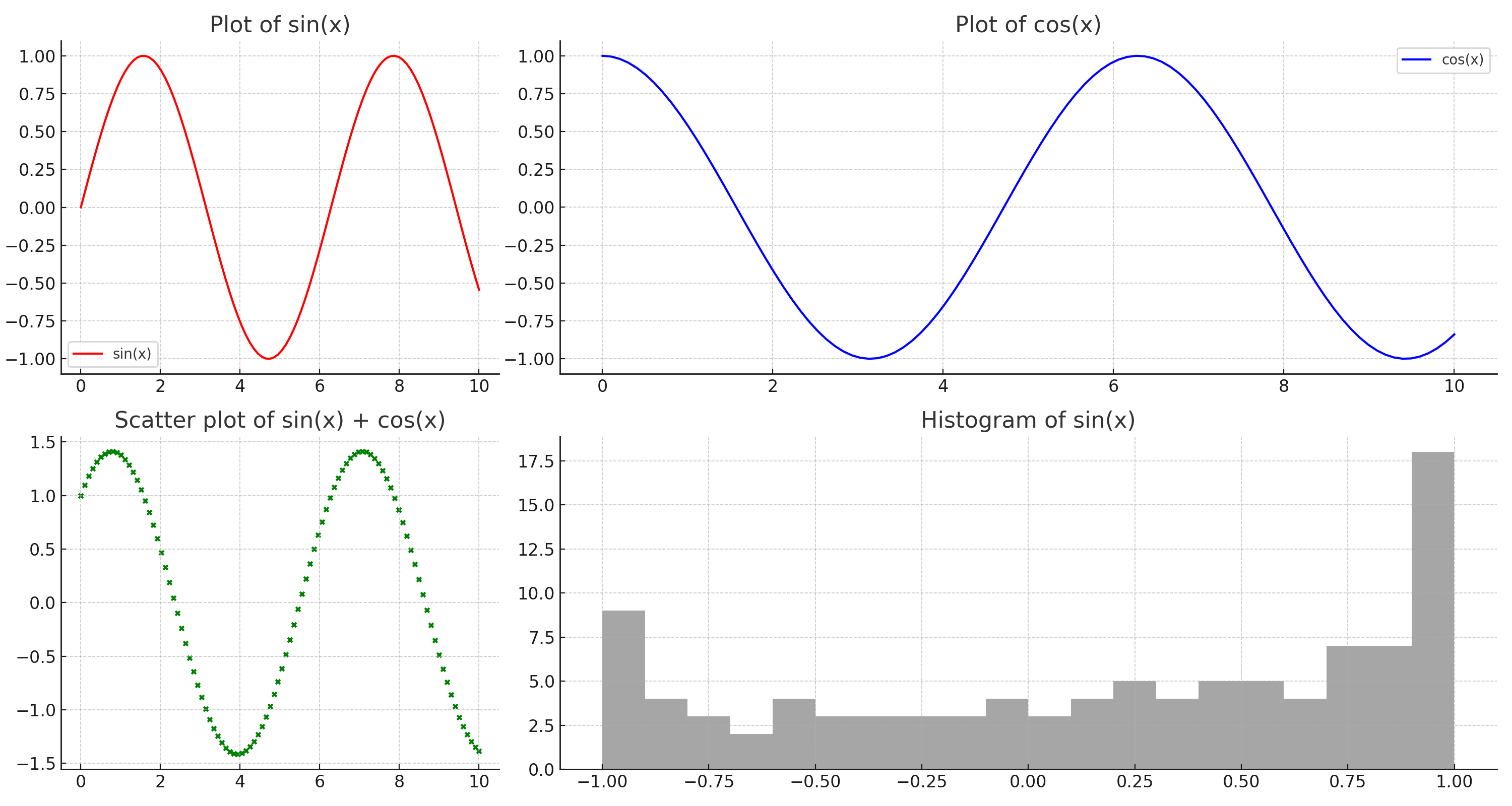
コードは以下を参考にしてください。
layout = [
    ["sin", "cos", "cos"],
    ["scatter", "hist", "hist"]
]

fig, axdict = plt.subplot_mosaic(layout, figsize=(15, 8))

# 各サブプロットにデータをプロット
axdict['sin'].plot(x, y1, label='sin(x)', color='red')
axdict['sin'].set_title('Plot of sin(x)')
axdict['sin'].legend()

axdict['cos'].plot(x, y2, label='cos(x)', color='blue')
axdict['cos'].set_title('Plot of cos(x)')
axdict['cos'].legend()

axdict['scatter'].scatter(x, y1+y2, color='green', s=10)
axdict['scatter'].set_title('Scatter plot of sin(x) + cos(x)')

axdict['hist'].hist(y1, bins=20, color='grey', alpha=0.7)
axdict['hist'].set_title('Histogram of sin(x)')

plt.tight_layout()
plt.show()
どのようにサイズを指定するのか?
先ほど描画したときのコードを確認します。
layoutリストの中で各サブプロットの位置やサイズを定義しています。
リスト内の各リストはフィギュアの行を表し、その中の文字列(キー)は各セルに配置されるサブプロットを表します。
同じキーが連続して配置されると、それらのセルは1つのサブプロットに結合されます。
layout = [
    ["sin", "cos", "cos"],
    ["scatter", "hist", "hist"]
]
その後、どのグラフがどのラベルに該当するかを指定しながらグラフを定義します。
事前にaxdict変数にレイアウトが格納されています。
axdict['sin']のようにラベルを指定することで描画の詳細を指定できます。
fig, axdict = plt.subplot_mosaic(layout, figsize=(15, 8))]

axdict['sin'].plot(x, y1, label='sin(x)', color='red')
axdict['sin'].set_title('Plot of sin(x)')
axdict['sin'].legend()

axdict['cos'].plot(x, y2, label='cos(x)', color='blue')
axdict['cos'].set_title('Plot of cos(x)')
axdict['cos'].legend()

axdict['scatter'].scatter(x, y1+y2, color='green', s=10)
axdict['scatter'].set_title('Scatter plot of sin(x) + cos(x)')

axdict['hist'].hist(y1, bins=20, color='grey', alpha=0.7)
axdict['hist'].set_title('Histogram of sin(x)')
オススメ書籍
・化学のためのPythonによるデータ解析・機械学習入門
データ分析に必要な最低限の知識を解説したうえで、化学プラントで得られるデータの扱い方が紹介されています。
脱ブタン塔や排煙脱硝装置を例に取り上げられておりイメージしやすくなっています。
 | 金子 弘昌 |本 | 通販 | Amazon")
化学のためのPythonによるデータ解析・機械学習入門
www.amazon.co.jp
・Pythonによる時系列分析: 予測モデル構築と企業事例
プロセス製造において時系列データの分析は欠かせません。
どのように時系列予測モデルを構築し、ビジネスへ活用していくかを詳細なPythonコードとともに解説してくれます。

Pythonによる時系列分析: 予測モデル構築と企業事例
www.amazon.co.jp
・PyCaretで学ぶ 機械学習入門
機械学習モデルを構築するのは想像以上に手間がかかります。
その一連の作業を自動化できるPyCaretというライブラリの使い方が分かりやすく解説されています。

PyCaretで学ぶ 機械学習入門
www.amazon.co.jp


